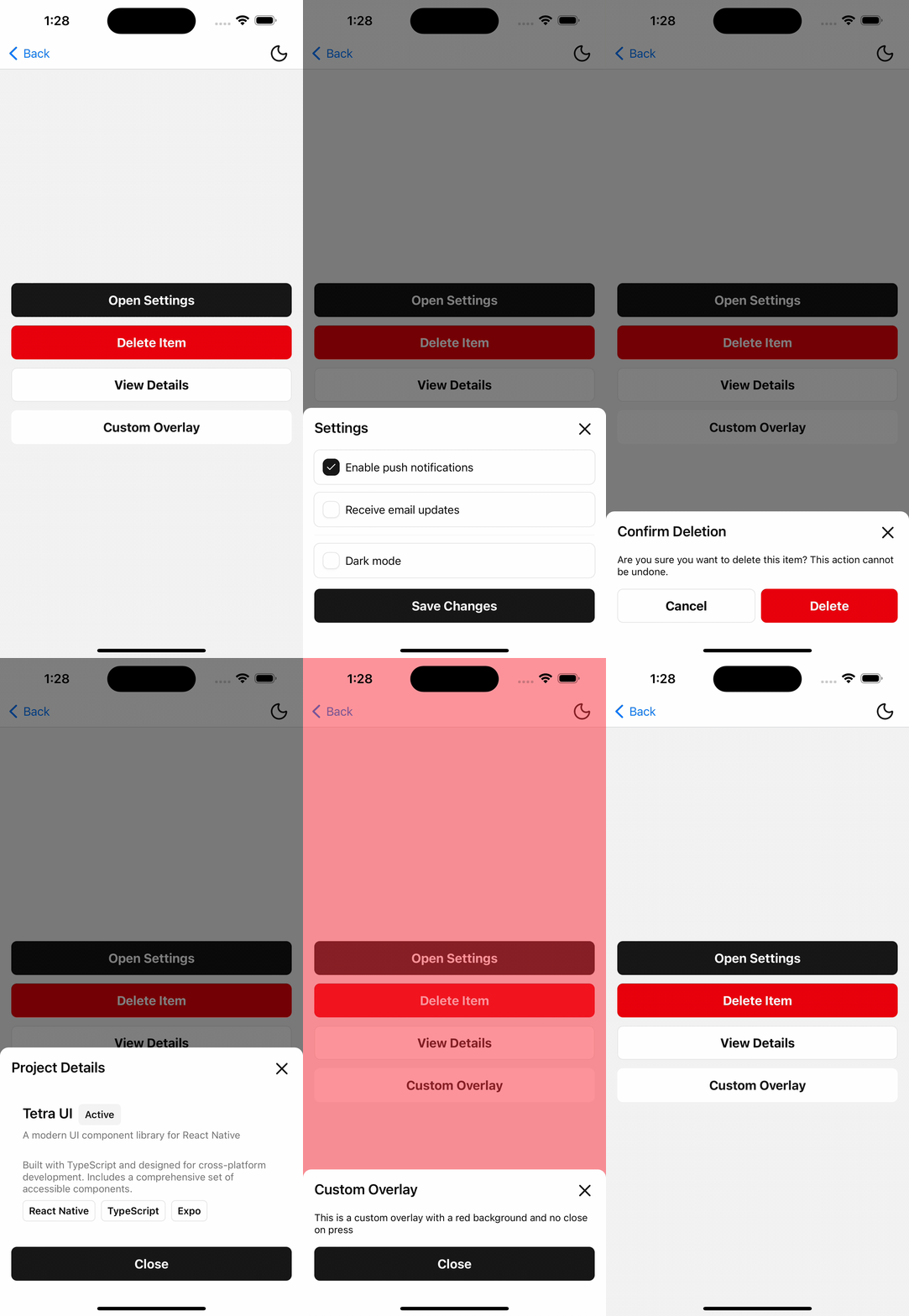
Native Sheet
A sheet component that can be used to display content in a modal.
Native Sheet uses React Native's Modal component to display a dynamic sheet at the bottom of the screen.

Installation
npx shadcn@latest add @tetra-ui/native-sheetUsage
import { Button, ButtonText } from "@/components/ui/button";
import {
  NativeSheet,
  NativeSheetBody,
  NativeSheetClose,
  NativeSheetContent,
  NativeSheetFooter,
  NativeSheetHeader,
  NativeSheetModal,
  NativeSheetOverlay,
  NativeSheetTitle,
  NativeSheetTrigger,
} from "@/components/ui/native-sheet";<NativeSheet>
<NativeSheetTrigger asChild>
<Button>
<ButtonText>Open</ButtonText>
</Button>
</NativeSheetTrigger>
<NativeSheetModal>
<NativeSheetOverlay />
<NativeSheetContent>
<NativeSheetHeader>
<NativeSheetTitle>Native Sheet Title</NativeSheetTitle>
</NativeSheetHeader>
<NativeSheetBody>
<Text className="text-foreground">Native Sheet Body</Text>
</NativeSheetBody>
<NativeSheetFooter>
<NativeSheetClose>
<Button>
<ButtonText>Close</ButtonText>
</Button>
</NativeSheetClose>
</NativeSheetFooter>
</NativeSheetContent>
</NativeSheetModal>
</NativeSheet>Changelog
2025-11-28 Composition Changes
Native Sheet has an improved composition pattern and now exports the following additional components:
NativeSheetModalNativeSheetOverlay
2025-11-30 Slot
Introduces the new Slot component to help manage composition patterns throughout the library.
