Avatar
An image element with a fallback for representing the user.
Installation
npx shadcn@latest add @tetra-ui/avatarUsage
import {
  Avatar,
  AvatarFallback,
  AvatarImage,
} from "@/components/ui/avatar";<Avatar>
<AvatarImage
src="https://images.unsplash.com/photo-1472099645785-5658abf4ff4e?w=100&h=100&fit=crop&crop=face"
alt="Avatar"
/>
<AvatarFallback>JD</AvatarFallback>
</Avatar>Composition
Avatar
├── AvatarImage
├── AvatarFallback
└── AvatarBadge

AvatarGroup
├── Avatar
│   ├── AvatarImage
│   ├── AvatarFallback
│   └── AvatarBadge
└── AvatarGroupCount
Badge
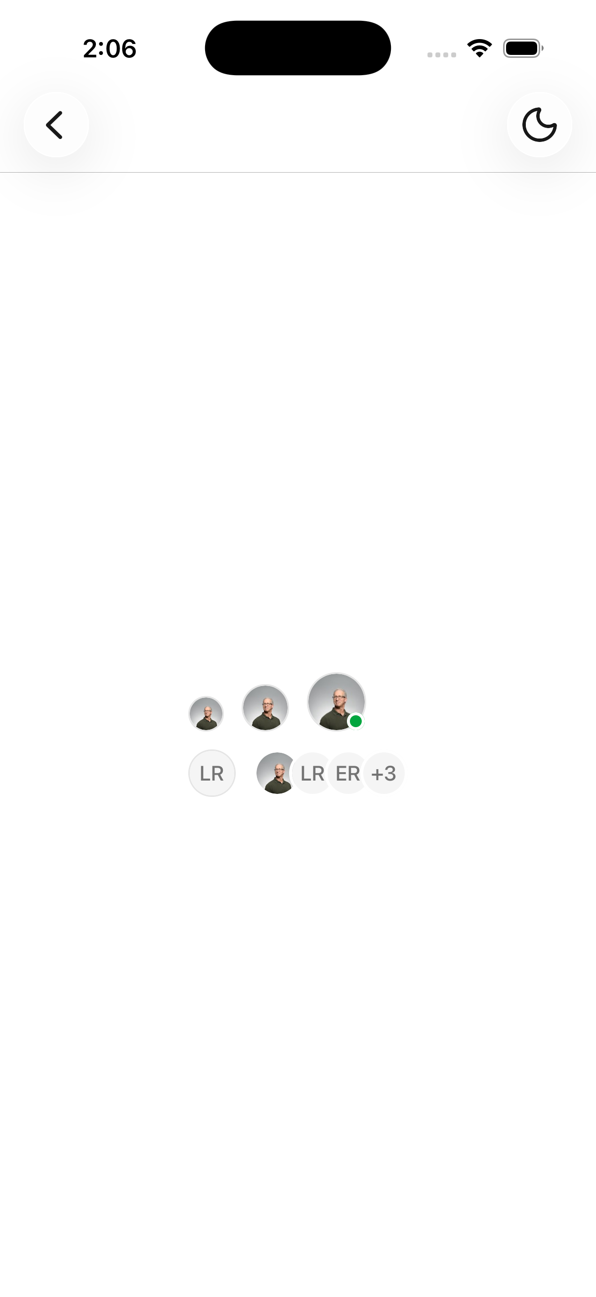
Use AvatarBadge to add a status indicator at the bottom right of the avatar.
<Avatar>
  <AvatarImage
    src="https://images.unsplash.com/photo-1472099645785-5658abf4ff4e?w=100&h=100&fit=crop&crop=face"
    alt="Avatar"
  />
  <AvatarFallback>JD</AvatarFallback>
  <AvatarBadge className="bg-green-600 dark:bg-green-800" />
</Avatar>
Avatar group
Use AvatarGroup and AvatarGroupCount to stack overlapping avatars.
<AvatarGroup>
  <Avatar>
    <AvatarFallback>JD</AvatarFallback>
  </Avatar>
  <Avatar>
    <AvatarFallback>LR</AvatarFallback>
  </Avatar>
  <AvatarGroupCount>+3</AvatarGroupCount>
</AvatarGroup>
Sizes
Use the size prop to change the size of the avatar.
<Avatar size="sm">
  <AvatarFallback>JD</AvatarFallback>
</Avatar>
<Avatar size="default">
  <AvatarFallback>JD</AvatarFallback>
</Avatar>
<Avatar size="lg">
  <AvatarFallback>JD</AvatarFallback>
</Avatar>
API Reference
Avatar
Extends React Native View props.
Prop
Type
AvatarImage
Extends React Native Image props. Renders nothing when neither source nor src is provided. Must be used within Avatar.
Prop
Type
AvatarFallback
Extends React Native View props. Hidden once the image has loaded. String children are wrapped in Text. Must be used within Avatar.
AvatarBadge
Extends React Native View props. Sized from the parent Avatar context. Must be used within Avatar.
AvatarGroup
Extends React Native View props. Overlaps child avatars with a border.
AvatarGroupCount
Extends React Native View props. String children are wrapped in Text.