Choicebox
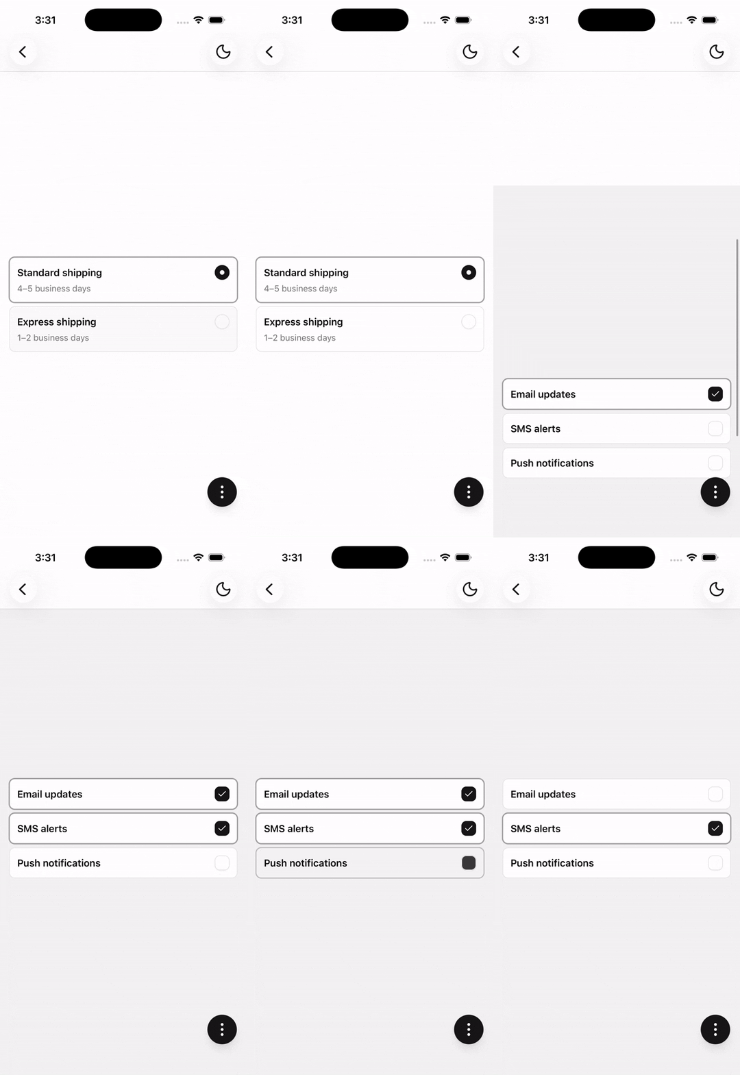
A group of selectable cards for single or multiple choice.
Installation
npx shadcn@latest add @tetra-ui/choiceboxUsage
import {
  Choicebox,
  ChoiceboxItem,
  ChoiceboxItemDescription,
  ChoiceboxItemHeader,
  ChoiceboxItemTitle,
} from "@/components/ui/choicebox";<Choicebox type="single" defaultValue="standard">
<ChoiceboxItem value="standard">
<ChoiceboxItemHeader>
<ChoiceboxItemTitle>Standard shipping</ChoiceboxItemTitle>
<ChoiceboxItemDescription>4–5 business days</ChoiceboxItemDescription>
</ChoiceboxItemHeader>
</ChoiceboxItem>
<ChoiceboxItem value="express">
<ChoiceboxItemHeader>
<ChoiceboxItemTitle>Express shipping</ChoiceboxItemTitle>
<ChoiceboxItemDescription>1–2 business days</ChoiceboxItemDescription>
</ChoiceboxItemHeader>
</ChoiceboxItem>
</Choicebox>Single vs multiple
Use type="single" (default) for one selection with a radio indicator, or type="multiple" for many selections with checkboxes:
<Choicebox type="multiple" defaultValue={["newsletter"]}>
  <ChoiceboxItem value="newsletter">Email updates</ChoiceboxItem>
  <ChoiceboxItem value="sms">SMS alerts</ChoiceboxItem>
</Choicebox>
Clearable
When type is single, set clearable to allow clearing the active selection:
<Choicebox type="single" clearable defaultValue="standard">
  {/* ... */}
</Choicebox>
Controlled
Pass value and onValueChange for controlled state:
const [value, setValue] = useState<string | undefined>("standard");

<Choicebox
  type="single"
  clearable
  value={value}
  onValueChange={setValue}
>
  {/* ... */}
</Choicebox>
For multiple selection, value is a string[]:
const [value, setValue] = useState<string[]>(["newsletter"]);

<Choicebox type="multiple" value={value} onValueChange={setValue}>
  {/* ... */}
</Choicebox>
Item content
Pass a string as ChoiceboxItem children for a simple label, or compose ChoiceboxItemHeader, ChoiceboxItemTitle, and ChoiceboxItemDescription for richer content:
<ChoiceboxItem value="pro">
  <ChoiceboxItemHeader>
    <ChoiceboxItemTitle>Pro plan</ChoiceboxItemTitle>
    <ChoiceboxItemDescription>$12/month</ChoiceboxItemDescription>
  </ChoiceboxItemHeader>
</ChoiceboxItem>
Invalid and disabled
Pass invalid on the root to style all indicators, or disabled on the root or individual items:
<Choicebox invalid>
  {/* ... */}
</Choicebox>

<ChoiceboxItem value="express" disabled>
  Express shipping
</ChoiceboxItem>
Layout
Use direction="row" to lay out items horizontally:
<Choicebox direction="row" type="single" defaultValue="monthly">
  <ChoiceboxItem value="monthly">Monthly</ChoiceboxItem>
  <ChoiceboxItem value="yearly">Yearly</ChoiceboxItem>
</Choicebox>
API Reference
Choicebox
Root selection state. Renders children in a Stack.
Prop
Type
ChoiceboxItem
Extends InputGroup. Must be used within Choicebox.
Prop
Type
ChoiceboxItemHeader
Extends React Native View props.
ChoiceboxItemTitle
Extends React Native Text props.
ChoiceboxItemDescription
Extends React Native Text props.
ChoiceboxIndicator
Renders a Radio or Checkbox from root type and selection state. No props. Auto-injected when omitted from ChoiceboxItem.
Changelog
2026-09-16 - Slots integration
- Migrate to use
@tetra-ui/slotsfor slot management and allow for dynamic component composition.
2026-09-11 - Migrate to InputGroup
- Migrate
InputPressabletoInputGroupand change press behavior.