Progress
Displays an indicator showing the completion progress of a task.
Installation
npx shadcn@latest add @tetra-ui/progressUsage
import {
  Progress,
  ProgressLabel,
  ProgressValue,
} from "@/components/ui/progress";<Progress value={60}>
<ProgressLabel>Uploading</ProgressLabel>
<ProgressValue />
</Progress>Label and value
Compose ProgressLabel and ProgressValue to show a label alongside the current percentage. ProgressValue reads value and max from context and renders automatically:
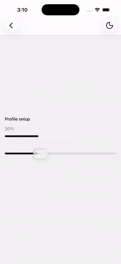
<Progress value={45} max={100}>
  <ProgressLabel>Profile setup</ProgressLabel>
  <ProgressValue />
</Progress>
You can also pass custom children to ProgressLabel:
<Progress value={2} max={5}>
  <ProgressLabel>Step 2 of 5</ProgressLabel>
</Progress>
Variants
Use the variant prop to switch between a continuous bar and discrete steps:
<Progress value={60} />
<Progress max={5} value={3} variant="steps" />
Linear
The default linear variant renders a single rounded track. Pass value from 0 to max (default 100) to control fill:
<Progress value={72} max={100}>
  <ProgressLabel>Downloading</ProgressLabel>
  <ProgressValue />
</Progress>
Steps
The steps variant renders separate bars with a small gap between each step. Set max to the total number of steps and value to the current step progress:
<Progress max={5} value={3} variant="steps">
  <ProgressLabel>Onboarding</ProgressLabel>
  <ProgressValue />
</Progress>
Fractional values partially fill the active step:
<Progress max={5} value={2.5} variant="steps" />