Radio
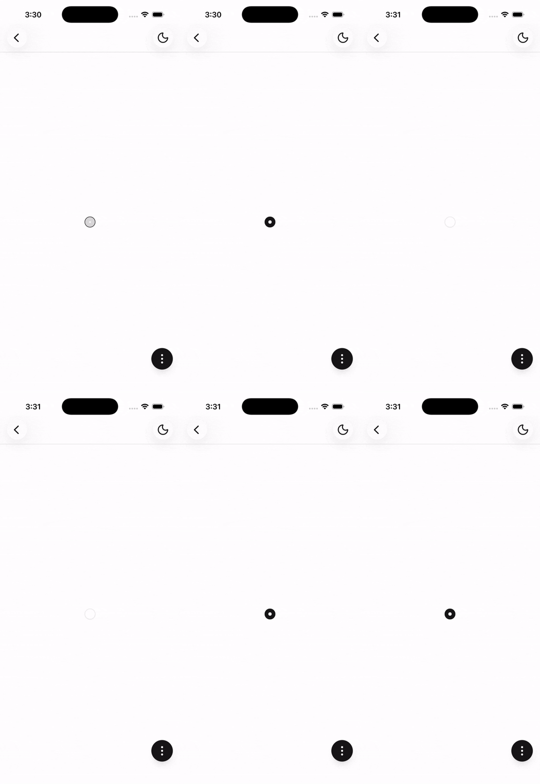
A control that indicates a selected option within a group.
Installation
npx shadcn@latest add @tetra-ui/radioUsage
import { Radio } from "@/components/ui/radio";<Radio checked />Controlled
Manage checked state externally and wire up a pressable wrapper to toggle:
const [checked, setChecked] = useState(false);

<Pressable onPress={() => setChecked((prev) => !prev)}>
  <Radio checked={checked} />
</Pressable>
Invalid state
Pass invalid to show a destructive border, typically when paired with form validation:
<Radio checked={checked} invalid />With Choicebox
For selectable option groups, use Choicebox instead of wiring up individual radios:
<Choicebox type="single" defaultValue="standard">
  <ChoiceboxItem value="standard">Standard shipping</ChoiceboxItem>
  <ChoiceboxItem value="express">Express shipping</ChoiceboxItem>
</Choicebox>
API Reference
Radio
Extends React Native View props (children omitted). Visual-only — wrap in a Pressable (or use Choicebox) to handle selection.
Prop
Type