Floating Action Button
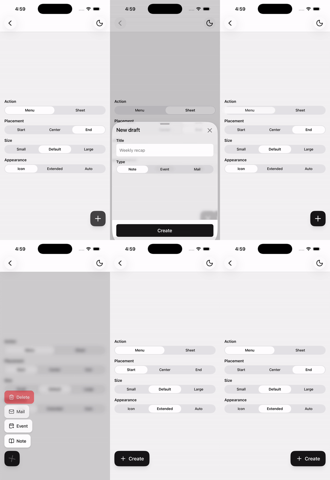
A positioned primary action that can expand into an extended label and open a FAB menu.
Installation
npx shadcn@latest add @tetra-ui/floating-action-buttonUsage
Wrap the screen in FabHost and render Fab as a sibling of your ScrollView, not inside it.
import {
  Fab,
  FabHost,
  FabIcon,
  FabText,
} from "@/components/ui/floating-action-button";
import { PlusIcon } from "@/components/ui/icons";<FabHost>
<Content />
<Fab accessibilityLabel="Create">
<FabIcon>
<PlusIcon />
</FabIcon>
</Fab>
</FabHost>Without FabHost, Fab is an in-flow button (no absolute positioning, no menu scrim). FabHost composes Scrim so the menu overlay can be reused elsewhere.
Extended
Include FabText and set appearance. "auto" uses an extended FAB at a window width of 768 and above.
<Fab accessibilityLabel="Create" appearance="extended">
  <FabIcon>
    <PlusIcon />
  </FabIcon>
  <FabText>Create</FabText>
</Fab>
Menu
FabMenu toggles on press. The trigger icon morphs to a close icon. Tap the scrim, press the FAB again, or use Android back to dismiss. Do not combine a menu and a bottom sheet on the same FAB.
<Fab accessibilityLabel="Create">
  <FabIcon>
    <PlusIcon />
  </FabIcon>
  <FabMenu>
    <FabMenuItem key="note">
      <FabMenuItemIcon>
        <BookOpenIcon />
      </FabMenuItemIcon>
      <FabMenuItemLabel>Note</FabMenuItemLabel>
    </FabMenuItem>
    <FabMenuItem key="event">
      <FabMenuItemIcon>
        <CalendarPlusIcon />
      </FabMenuItemIcon>
      <FabMenuItemLabel>Event</FabMenuItemLabel>
    </FabMenuItem>
    <FabMenuItem key="delete" variant="destructive">
      <FabMenuItemIcon>
        <TrashIcon />
      </FabMenuItemIcon>
      <FabMenuItemLabel>Delete</FabMenuItemLabel>
    </FabMenuItem>
  </FabMenu>
</Fab>
Bottom sheet
Compose with BottomSheet for free-form content. Pass the same open state into Fab so the icon morphs. The sheet owns its overlay.
<BottomSheet open={open} onOpenChange={setOpen}>
  <BottomSheetTrigger asChild>
    <Fab accessibilityLabel="New item" open={open}>
      <FabIcon>
        <PlusIcon />
      </FabIcon>
    </Fab>
  </BottomSheetTrigger>
  <BottomSheetContent>
    {/* anything */}
  </BottomSheetContent>
</BottomSheet>
If this FAB sits inside a FabHost that already positions another FAB, set positioned={false} so it stays in the layout.
Positioning
FabHost is the positioning context. Default edge is bottom-end, with 16pt padding plus safe-area insets. Use bottomInset for tab bars and offset for extra spacing.
<Fab edge="bottom-start" bottomInset={56} />Keep Fab inside FabHost. The host slots the button above the menu scrim, so it does not need to be a direct child.
API Reference
FabHost
Extends React Native View props. Provides positioning and the menu scrim.
Fab
Wraps Button. Root is a single Pressable so it works with BottomSheetTrigger asChild.
Prop
Type
FabIcon
Resting icon. Morphs to a built-in close icon while open is true.
FabText
Label shown when the visual appearance is extended.
FabMenu
Registers menu items with FabHost. Presence of this part makes press toggle the menu.
FabMenuItem
A pressable menu row. Not a Button. Defaults to variant="default".
Prop
Type
FabMenuItemIcon
Icon inside a menu item. Optional.
FabMenuItemLabel
Label inside a menu item. Required for a usable item.