Swipeable
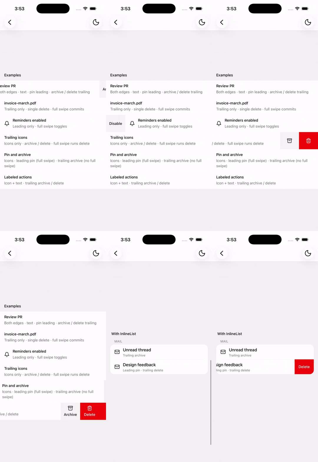
Swipe leading and trailing actions onto row content.
Installation
npx shadcn@latest add @tetra-ui/swipeableSetup
Wrap your app in GestureHandlerRootView (or use the tetra-ui ThemeProvider, which already includes it):
import { GestureHandlerRootView } from "react-native-gesture-handler";

export default function RootLayout({ children }) {
  return (
    <GestureHandlerRootView style={{ flex: 1 }}>{children}</GestureHandlerRootView>
  );
}
Usage
import {
  Swipeable,
  SwipeableAction,
  SwipeableActionGroup,
  SwipeableContent,
  SwipeableList,
} from "@/components/ui/swipeable";<SwipeableList>
<Swipeable>
<SwipeableContent onPress={() => {}}>
<Text>Message from Expo</Text>
</SwipeableContent>
<SwipeableActionGroup edge="leading" allowsFullSwipe={false}>
<SwipeableAction onPress={() => {}}>Pin</SwipeableAction>
</SwipeableActionGroup>
<SwipeableActionGroup edge="trailing">
<SwipeableAction variant="destructive" onPress={() => {}}>
Delete
</SwipeableAction>
</SwipeableActionGroup>
</Swipeable>
</SwipeableList>Press vs swipe
Row presses must participate in the gesture-handler system so a swipe does not also fire onPress. Put onPress on SwipeableContent (gesture-handler Pressable). Do not nest React Native’s Pressable — including InlineListItem’s onPress — inside a swipeable row; keep InlineListItem presentational and press via SwipeableContent.
Exclusive open
Wrap sibling rows in SwipeableList so opening one closes the others (Mail-style). Rows register through context, so nesting inside InlineList or a map still works. Use useSwipeableList().closeAll() to shut every row (for example when the list scrolls or navigates away). Pass exclusive={false} to keep closeAll without auto-closing siblings.
Composition
SwipeableList
└── Swipeable
    ├── SwipeableContent
    ├── SwipeableActionGroup
    │   └── SwipeableAction
    │       ├── SwipeableActionIcon
    │       └── SwipeableActionText
    └── SwipeableActionGroup
With Inline List
Wrap each row in Swipeable, and wrap the list in SwipeableList for exclusive open. Separators still apply automatically — InlineList provides separator context through any wrapper to nested InlineListItems:
import {
  InlineList,
  InlineListItem,
  InlineListItemTitle,
} from "@/components/ui/inline-list";
import {
  Swipeable,
  SwipeableAction,
  SwipeableActionGroup,
  SwipeableContent,
  SwipeableList,
} from "@/components/ui/swipeable";

<SwipeableList>
  <InlineList title="Inbox">
    <Swipeable>
      <SwipeableContent onPress={() => {}}>
        <InlineListItem>
          <InlineListItemTitle>Message from Expo</InlineListItemTitle>
        </InlineListItem>
      </SwipeableContent>
      <SwipeableActionGroup edge="trailing">
        <SwipeableAction variant="destructive" onPress={() => {}}>
          Delete
        </SwipeableAction>
      </SwipeableActionGroup>
    </Swipeable>
    <Swipeable>
      <SwipeableContent>
        <InlineListItem>
          <InlineListItemTitle>Welcome to tetra-ui</InlineListItemTitle>
        </InlineListItem>
      </SwipeableContent>
      <SwipeableActionGroup edge="trailing">
        <SwipeableAction variant="secondary" onPress={() => {}}>
          Archive
        </SwipeableAction>
        <SwipeableAction variant="destructive" onPress={() => {}}>
          Delete
        </SwipeableAction>
      </SwipeableActionGroup>
    </Swipeable>
  </InlineList>
</SwipeableList>
Full swipe
Set allowsFullSwipe on SwipeableActionGroup (defaults to true):
- Overshoot bleeds the outermost action’s color (trailing → last child, leading → first child)
- Dragging past about halfway across the screen arms that action (sibling labels/icons fade)
- Pull back before release to disarm — the action only runs on gesture release while still armed
- Works for both leading and trailing groups (
allowsFullSwipedefaults totrue) - Set
allowsFullSwipe={false}to keep rubber-band overshoot without arming or auto-performing
Icons
Use SwipeableActionIcon for icon-only or icon + label actions. Labels stack under the icon and stay centered. Add an accessibilityLabel when there is no visible text:
import { ArchiveIcon, TrashIcon } from "@/components/ui/icons";
import {
  Swipeable,
  SwipeableAction,
  SwipeableActionGroup,
  SwipeableActionIcon,
  SwipeableContent,
} from "@/components/ui/swipeable";

{/* Icon only */}
<SwipeableAction accessibilityLabel="Delete" variant="destructive" onPress={() => {}}>
  <SwipeableActionIcon>
    <TrashIcon />
  </SwipeableActionIcon>
</SwipeableAction>

{/* Icon + text */}
<SwipeableAction variant="secondary" onPress={() => {}}>
  <SwipeableActionIcon>
    <ArchiveIcon />
  </SwipeableActionIcon>
  Archive
</SwipeableAction>
API
SwipeableList
Wraps sibling Swipeable rows so opening one can close the others. Registration is context-based, so rows may be nested in InlineList, fragments, or mapped children.
Prop
Type
useSwipeableList() returns { closeAll } for the nearest list (no-op outside one).
Swipeable
Built on ReanimatedSwipeable. Forwards friction, thresholds, open/close callbacks, enabled, and a ref with close / openLeft / openRight / reset.
Prop
Type
SwipeableContent
Required slot for the row content revealed by default. The content surface uses bg-card so actions slide out from behind an opaque row. When onPress is set, the surface uses gesture-handler Pressable so taps do not fire during a swipe.
Prop
Type
SwipeableActionGroup
Action group revealed when swiping from an edge.
Prop
Type
SwipeableAction
Pressable action button. String children become SwipeableActionText.
Prop
Type
SwipeableActionText
Label text styled from the parent SwipeableAction context.
SwipeableActionIcon
Clones a single child icon with size and color from the parent SwipeableAction context.
Prop
Type
Changelog
2026-09-16 - Slots integration
- Migrate to use
@tetra-ui/slotsfor slot management and allow for dynamic component composition.