Carousel
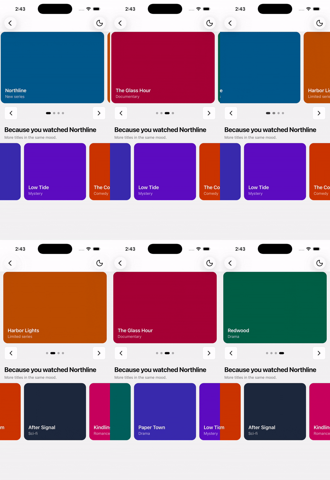
Swipe between pages or an inline rail of items, with optional looping, autoplay, and composed controls.
Installation
npx shadcn@latest add @tetra-ui/carouselSetup
Wrap your app in GestureHandlerRootView (or use the tetra-ui ThemeProvider, which already includes it):
import { GestureHandlerRootView } from "react-native-gesture-handler";

export default function RootLayout({ children }) {
  return (
    <GestureHandlerRootView style={{ flex: 1 }}>{children}</GestureHandlerRootView>
  );
}
Set an explicit height on Carousel. The track fills the space above the controls.
Usage
import {
  Carousel,
  CarouselContent,
  CarouselDots,
  CarouselItem,
  CarouselNext,
  CarouselPrevious,
} from "@/components/ui/carousel";
import { Stack } from "@/components/ui/stack";<Carousel className="h-64">
<CarouselContent>
<CarouselItem>...</CarouselItem>
<CarouselItem>...</CarouselItem>
<CarouselItem>...</CarouselItem>
</CarouselContent>
<Stack className="items-center justify-between" direction="row">
<CarouselPrevious />
<CarouselDots />
<CarouselNext />
</Stack>
</Carousel>Composition
Carousel
├── CarouselContent
│   └── CarouselItem
├── CarouselPrevious
├── CarouselDots
└── CarouselNext
Every piece except the root, content, and items is optional. Controls are in-flow under the track — place Previous, Dots, and Next in a row.
Variants
page (default) makes each item the full track width. inline sizes items evenly so more than one is visible. perView is how many items fit in the viewport. A fractional value such as 1.2 leaves leftover space that is split so you see a peek of the previous card and the next. gap is the pixel space between items and is used for snap math.
Padding the carousel with px-4 (or similar) clips neighbors at that edge. Use inset instead when you want the settled item padded but previous and next items to enter from the track edge:
<Carousel className="h-80 w-full" inset={16}>
  <CarouselContent>
    <CarouselItem>...</CarouselItem>
    <CarouselItem>...</CarouselItem>
  </CarouselContent>
  <Stack className="px-4" direction="row">
    <CarouselPrevious />
    <CarouselDots />
    <CarouselNext />
  </Stack>
</Carousel><Carousel className="h-48" perView={2} variant="inline">
<CarouselContent>
<CarouselItem>...</CarouselItem>
<CarouselItem>...</CarouselItem>
<CarouselItem>...</CarouselItem>
</CarouselContent>
</Carousel>Loop
Pass loop to wrap from the last item back to the first. Looping is ignored when there are not enough items (page with fewer than 2, or inline with count <= perView).
<Carousel className="h-64" loop>
  <CarouselContent>
    <CarouselItem>...</CarouselItem>
    <CarouselItem>...</CarouselItem>
  </CarouselContent>
</Carousel>
Autoplay
autoplay advances one item at a time. It pauses while dragging, when the app backgrounds, and when Reduce Motion is enabled. Without loop, it stops on the last item.
<Carousel autoplay autoplayInterval={4000} className="h-64" loop>
  <CarouselContent>
    <CarouselItem>...</CarouselItem>
    <CarouselItem>...</CarouselItem>
  </CarouselContent>
  <CarouselDots />
</Carousel>
Controlled index
const [index, setIndex] = useState(0);

<Carousel className="h-64" index={index} onIndexChange={setIndex}>
  <CarouselContent>
    <CarouselItem>...</CarouselItem>
    <CarouselItem>...</CarouselItem>
  </CarouselContent>
</Carousel>
useCarousel() and a CarouselRef (scrollTo, scrollNext, scrollPrev, getIndex) expose the same navigation.
API
Carousel
Prop
Type
CarouselContent
Overflow-hidden viewport for the swipeable track.
CarouselItem
A single snap target. Width comes from the parent variant / perView.
CarouselPrevious / CarouselNext
Icon buttons built on Button. Disabled at the ends when loop is false.
Prop
Type
CarouselDots
Renders one pressable, progress-linked indicator per item. Omit this on long inline rails.
useCarousel
Must be called inside Carousel. Returns { index, count, looping, canScrollPrev, canScrollNext, scrollTo, scrollNext, scrollPrev, progress }.